More than a dozen industry leaders identify 14 kitchen design trends that are sure to lead the way in the coming year.
We’re predicting 2021 will be the year of the sanity-saving kitchen, as it’s been our home’s command center, the place to craft every meal, mix up every Zoom happy hour cocktail, catch up on emails, help with homework, and a place to reconnect with loved ones. As we’ve needed more space to live our lives almost completely between our own four walls, the kitchen has stepped up to be a family room, office, schooling room, and more, making it a prime place to invest in this year.
We asked more than a dozen top designers from across the country about their predictions for kitchen design trends in 2021, and the vast majority of them have seen common threads in light of this year’s events. Whether it’s a simple yet powerful upgrade that serves as an easy project or the addition of colorful, personal touches, we can’t wait to see what 2021 holds in store for our beloved kitchens.
Thinking Outside the Blasé Kitchen Box
“With social media and all of the different home sites, there is a lot of copying of kitchens, and I love to see people make their homes their own, thinking of what’s important to them and what they actually like, instead,” Birmingham-based designer Dana Wolter says. “There’s a greater focus on being creative.”
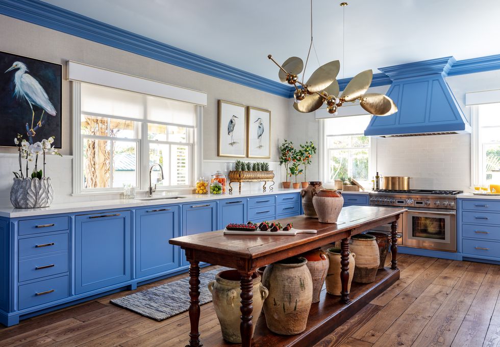
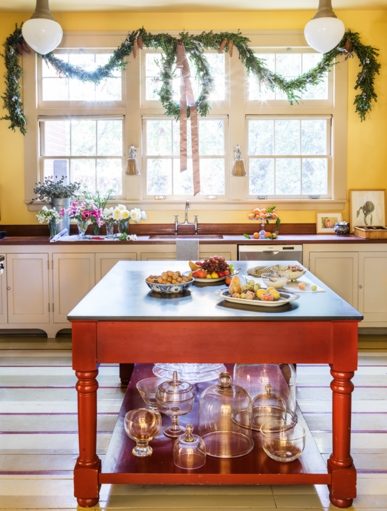
After many of us discovered our homes no longer worked for us during those early days of quarantine, the number of home renovation project skyrocketed—and more people began to tap into their creative sides. We’re seeing more kitchens with color that feel less like a sterile restaurant prep spot and more like a continuation of the rest of the home, filled with antiques, artwork, and personal pizzazz.
“It’s exciting to see people getting away from white kitchens, even though they will always be there,” Greenwich, Connecticut–based designer Sarah Blank says. “We’re seeing more color in the millwork and islands, along with perimeters, cabinets, and walls. Now so many people spend so much time in there today, why does it have to look so much like the kitchen? Why can’t it have artwork, why can’t it feel morel like the front of the house instead of the old back-of-house that feels dated and instead have the character of the other rooms? It’s really becoming the new family room and has a little bit of everything. You have your art and different moods, colors, and materials, and then you can think about the functionality after that. It has to be beautiful.”
Thinking Outside the Blasé Kitchen Box
“We are seeing a lot of great combinations in terms of color palettes in the kitchen,” says Barbara Sallick, co-founder of Waterworks and author of The Perfect Kitchen. “There can be warm-toned islands, plenty of color and wood in the space, even if the perimeters are mostly white.”
Dallas-based designer Jan Showers echoes the words of many other designers we chatted with, saying fewer of her clients want to have a white kitchen at all. They are seeking colorful options for walls, cabinets, and even materials, like Quartzite for the countertops instead of a white material.
“I am talking with clients about making the kitchen feel more like a room in the home,” says New York–based designer and VERANDA columnist Joy Moyler. “A couple of clients have asked for skirts under the sink and warmer wood-finish shelves. Modern kitchens will feel more like farmhouse kitchens, whether you are in the country or city. Less shiny with more soul. It’s an expansion on folks wanting to feel safe and cocooned and offers a sense of nostalgia.”
Tile, Tile Everywhere!
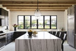
Tile isn’t just for the backsplash anymore. It’s going up, up, and away to the ceiling these days for a fresh, new look. This is a great option for those of us who love neutral kitchens but want to create more visual interest and further layer their space. Several designers shared with us that as more people ditch upper cabinetry (more on that later), they free up space to add some gorgeous hand-painted tile work or create a continuation of your backsplash around the room, which can make your kitchen look larger.
“Designers and homeowners are not shying away from showcasing the complexity or drama. Stone slabs are dominating backsplashes from countertop to ceiling, cascading to the floor in waterfall edges, and wrapping around islands,” says Nancy Epstein, founder and president of Artistic Tile. “It’s an exciting development, as these stones are so unique and beautiful and truly enhance these spaces in ways the basic neutrals they replace never could. They’re complemented by renewed interest in colorful mosaics and textured stone tile with mixed finishes, like our gold-leaf embossed Textura D’Oro.”
Top Priority
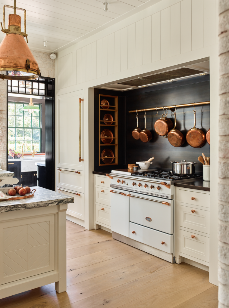
If there’s anything we’ve found solace in this year, it’s reorganizing our most highly trafficked spaces—and our kitchens have needed the most work. Whether your ideal level of organization is “the perfectly imperfect kitchen” or a scene straight from The Home Edit, finding more ways to beautifully organize our kitchens will likely become a top trend in 2021.
“Even prior to the pandemic, we were starting to see a reconsideration of the open floor plan,” says Andrew Cogar, president of Historical Concepts. “While great for casual entertaining, open flow, and general ease of living, the Achilles’ heel to the open floor plan is storage and organization. There is just not the same amount of space to put things away. And if something is left out or untidy, there is no ‘closing the door;’ it is all on display. The pandemic has exacerbated this condition with more people in the house around the clock due to remote work and school.”
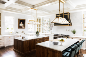
“A lot of what we’ve seen is with everyone stuck at home is a focus on function and order,” says Memphis-based designer Sean Anderson. “It’s all about getting rid of the usual clutter, focusing on organization, and fixing those inconsistencies we had to over look on our normal schedules. Form and function is paramount right now.”
Anderson says, especially with households of five and six people, he is seeing the implementation of more double kitchen islands, when possible. This offers not only more area for prepping dinner, but now there’s an extra space for doing homework, eating breakfast, catching up on emails, and working on creative projects. Dana Wolter says she’s also seeing more well-equipped islands that serve as charging and storage ports for the family’s electronics so the items can stay out of the way while getting charged up.
“We are pushing our clients to consider dual work triangles, one zone for prep & clean-up and one zone for cleaning and service,” says Cogar. “These zones may overlap, but thinking through a kitchen layout for these two specific functions (and with more than one person working in the kitchen at a time) can increase functionality and provide purpose to the aesthetics.”
The Rise of the Moody Kitchen
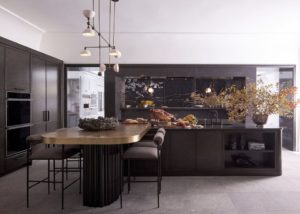
As consumers say goodbye to the all-white kitchen, designers have noted that there has been a strong gravitation to the moody or dark kitchen. Dallas-based designer Chad Dorsey designed this sleek, dramatic cook space for the inaugural Kips Bay Dallas Decorator Show House this fall.
Dorsey sought a European-elegance-meets-industrial edge aesthetic for this ultra-chic kitchen that features countertops, trim, and shelving by Cambria and a rustic Cantera floor from Materials Marketing. The addition of a few natural elements and the blend of textures keep the space feel as warm and inviting as it would if the kitchen were brighter.
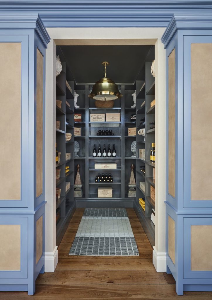
The Designer Walk-In Pantry
It’s official: The pantry is the new closet, and designers are all about creating these well organized, beautiful spaces that bring peace of mind to the owner. Whether you’re an avid home cook in need of organization for all your gourmet ingredients, an oenophile looking for a wine cellar, or a large family in need of a command center, a well-appointed walk-in pantry just might be the answer to your household’s prayers.
“My biggest desire for any kitchen in any house—and I know it’s a total luxury—is for a walk-in pantry that doesn’t have to be big but holds a bunch of those small appliances,” says Nashville-based designer Roger Higgins. “It can keep the kitchen looking so much cleaner, especially if you have an open-concept house and the kitchen is always visible. Even if it’s a small closet, you can still sneak in some counter space and make it special.”
Rethinking Upper Cabinets
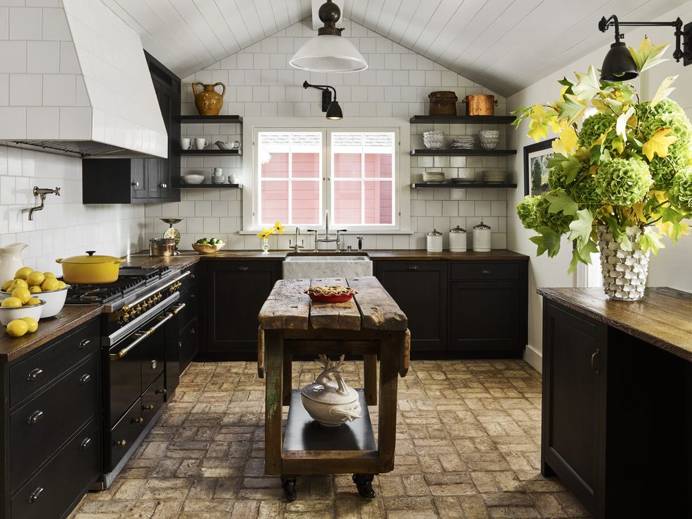
While there’s nothing wrong with them, upper cabinetry isn’t a kitchen necessity, as we’ve grown to see it. Designers are encouraging their clients to think outside the box, ditching bulky cabinetry and opting for open shelving or a blend of the two—or no upper storage at all.
“I am seeing a lot of enclosed kitchen spaces as opposed to large family room and kitchen areas that are open to the rest of the home, but within that space the designs tend to be more open planned with wall shelving and less built-in-looking cabinetry,” says Christopher Peacock, CEO of the eponymous cabinetry brand. “An eclectic, organic feel of mixed textures and materials is very welcoming and bistro-like, and this is certainly popular.”
Higgins says, especially as we are constantly using our diningware these days, it just makes more sense to have our everyday dishes more easily accessible and allows us to put our favorite pieces on full-display. He says it’s important for people to choose their everyday pieces wisely, knowing they are going to have to look at them every time they step into the kitchen.
Tastefully Hidden Appliances and Smart Technology
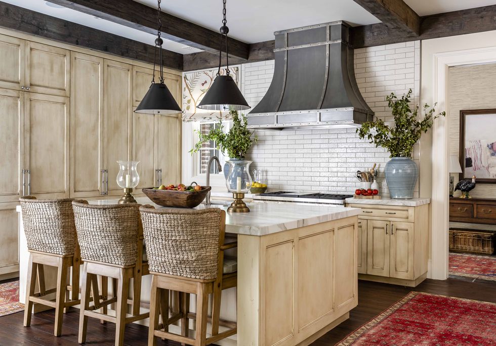
Some designers reported seeing a major increase in interest in smart appliances, while others said clients seem to be keeping far away from the latest, sleekest tech in the kitchen. Either way, designers on all sides have seen peaked interest for tastefully hiding their stainless steel appliances, most often with beautiful wood paneling. Smaller appliances have found new homes in a fabulous walk-in pantry or secondary kitchen space to free up the counters and prevent distractions from the room’s design aesthetic.
“One of my tips to creating a smart kitchen but keeping it pretty is using paneled appliances when possible,” says Wolter. “I do a lot of that, and it makes the kitchen super-functional while still being beautiful. You can still have all the new appliances but everything can blend with your existing cabinetry and interiors.”
The Resurgence of Craftsmanship
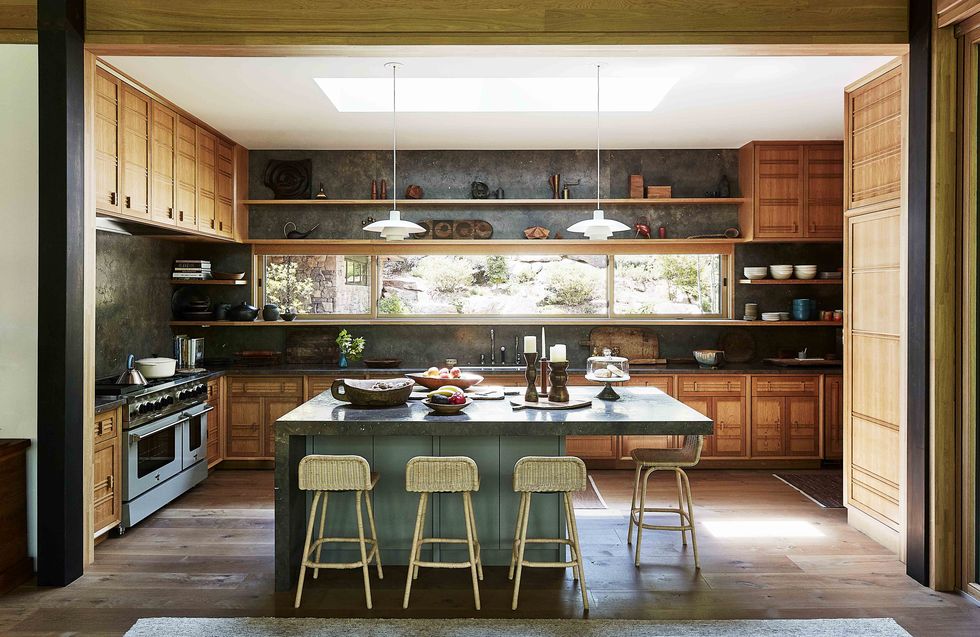
While Instagram-ready kitchens have lingered far too long at the top of design wishlists, designers are thrilled to see a greater prioritization of the forever-worthy kitchen over a Pinterest-worthy one. (The great thing is, they can still be both!) Forgoing trends for timelessness has been the urge of many of our favorite designers for a long time, and the people are listening.
“I think more than a few of us designers seem to be allergic to the word trend, and for me, I don’t like the idea of disposable design,” says Austin-based designer Mark Cravotta. “My clients pay a lot of money for beautiful interiors, and we aren’t in the finance industry, but we have some sort of fiduciary responsibility to ensure their investment won’t be wasted when what we’ve spent all this money on goes out of fashion. There’s a trend toward just that these days: things that last. We are really seeing a lot of this across the board, but kitchens get the biggest beating of anything in the house, functioning as both the workhorse and heart of the home, so it takes the most wear—and it’s the place family and guests like to congregate, whether you like them to or not. It deserves the investment.”
The Resurgence of Craftsmanship
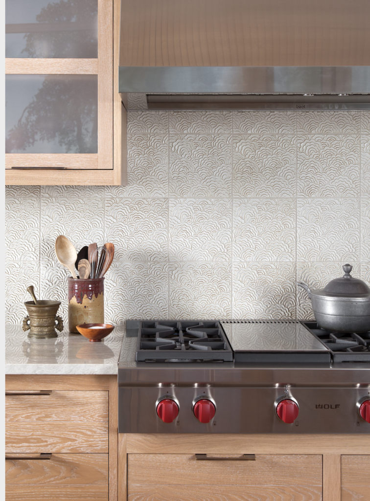
Cravotta says he is seeing a strong trend across the board toward designing with furnishings, materials, and craftsman finishes that can be fully lived in while still being high-quality, unique pieces.
“You can still have beautiful pieces without having to worry about stressing over the next time a guest is having too much of a good time,” he says. “There have been tremendous advances in outdoor upholstery (which is beautiful enough for the indoors now) that you can wipe off coffee or wine easily. In the kitchen, there are so many more options now that are better than polished granite.
When it comes to your next renovation project and to help you get one step closer to achieving your dream kitchen, Cravotta says there is truly no substitute for a personal reference when you’re seeking the best craftsmanship and quality work. Doing your homework to find the person whose product matches their marketing will save you the headache a few years down the road when your cabinetry is as sturdy as the day it was installed.
Ditching the Classic Stainless Steel Hood
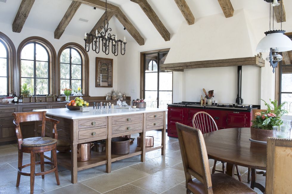
Whether you love or hate a decorative hood, designers are seeing stainless steel options getting a facelift, whether that’s blending in better with the surroundings or making a more artistic statement. Sallick says she’s seeing hoods getting more decorative with more metals being applied, while others, like Blank, are finding ways to decorate their hoods to feel part of the architecture, as shown here in this gorgeous Spanish Revival kitchen she designed.
The Return of “Second” Kitchens

Sculleries, butler’s pantries, mudrooms, oh my! One of the most common trends designers noted seeing was the addition or reworking of a secondary kitchen space to help make the main kitchen more organized and less hectic.
“To have this really large kitchen is great, but you have to think about the fact that cabinets only store so much,” Blank says. ” If you have a very functional kitchen, where you can actually get to the fridge and sink without rollerblading there, you need some supporting rooms—a butler’s pantry that works with the kitchen, a mudroom, small office spaces, these spaces that need to support the kitchen itself. People are getting deliveries, and Amazon is at the door every five minutes, so we need places to wrap and store and find homes for everything.”
Wolter says she has also seen a huge uptick in these “second kitchens,” which hold an extra dishwasher, a smaller fridge, and some beautiful dishware, to make life more accessible. She says these spaces are often full of color or wallpapered even when the main kitchen features a more neutral color palette.
The Return of “Second” Kitchens
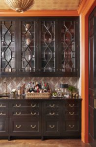
Another term for this trend is a “dirty kitchen,” which can be a secondary full-sized or partially equipped space to promote functionality and a more beautiful main room.
“This concept allows for a kitchen to remain the center of the house and focus on a very uncluttered and clean look when open to other rooms, so the space feels less utilitarian and more welcoming while still keeping useful items close by,” says Nashville-based designer Carolyn Kendall. “The introduction of a dirty-kitchen concept in our clients’ homes adds a secondary adjacent space that holds the less pretty but very functional items that we all need to have at our fingertips but not in the direct line of site to our living spaces. This space is often an extension of the kitchen and may be through a cased opening but can often have the same cabinets and counter tops to tie it to the rest of the kitchen.”
This space is all about creating a more pleasant morning ritual, by holding a fully equipped coffee bar on the counter or a better entertaining experience with a second set of prepped foods and drinks ready at your beck and call.
Investing in Fancier Fixtures and Finishes
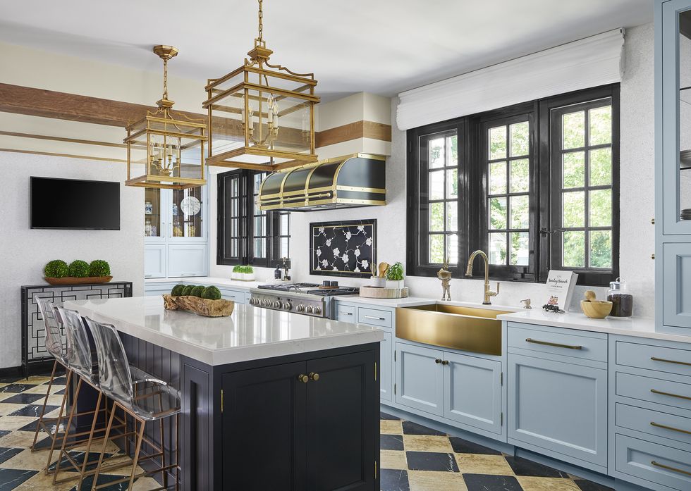
While many of us have avoided getting our hands dirty with big renovations this year, smaller projects, like upgrading our kitchen fixtures and finishes, have proved a rewarding and valuable task. Several designers predict a surge in choosing more beautiful fixtures, be they touchless or just extra beautiful.
“We do a lot with cast-bronze hardware and other speciality hardware,” Cravotta says. “We’re big on using handmade tiles and special light fixtures, things that can really create something special, a composition you won’t see in other photos on social media and that will actually stand the test of time.”
Sallick says people are realizing just how much of a huge deal hardware is, and she recommends upgrading to brass and adding a fresh coat of paint to make your kitchen feel brand-new in an afternoon’s work.
More Environmentally Conscious Design
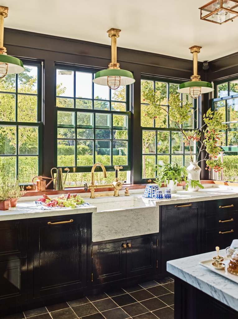
“More and more, we find people wanting to create not only spaces that reflect them, but places of self-care and health,” says Bob Williams, president of Mitchell Gold + Bob Williams. “In choosing well made, sustainably produced products that contribute meaningfully to home as a place of wellbeing, caring, happiness, and love, people are choosing furnishings with greater intent and deeper consciousness.”
Whether it’s for the health of your family, the planet, or both, designers are noticing a greater interest in cultivating a kitchen with the right materials to ensure it is the happy, healthy space it needs to be.
“We love that people are really requesting wood or marble or un-lacquered brass and other natural materials these days,” Sallick says. “You can always tell when someone uses the same thing when it’s not real because it all looks the same. We love the romance of using natural materials because they give the kitchen a bit of magic.”
More Environmentally Conscious Design

Besides selecting more environmentally friendly materials, several designers noted that it’s important to choose functional windows that can let fresh air in—and the bad stuff out. “With the advances in building technology over the past 20-plus years, homes are now very ‘tight’ in terms of airflow and moisture movement at the building envelope,” Cogar says. “While that’s good from an efficiency standpoint, the houses don’t breathe on their own. This is compounded by the ever-increasing range hoods and exhaust fans that displace large amounts of air in a home over a short period of time. As a result, homes have become much more reliant on mechanically bringing fresh air into the home. This is good from an energy standpoint but can lead to air-quality issues if filters are not changed regularly and/or any obstructions to airflow occur.”
Cogar is seeing a renewed interest in year-round natural ventilation, which is creating inquires for operable windows and window screens in the kitchen, adding always-desired natural light to your cook space.
Blank says she’s also seeing a rise in low-VOC paint to color our walls, UV lighting in duct work, and interest in filtration options.
Greater Interest in Outdoor Kitchens
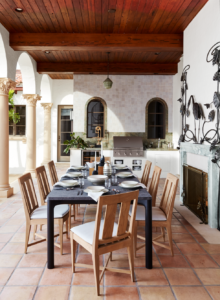
“Though outdoor kitchens have been popular for a while now, they’ve gone from being a ‘would like to have’ to a must-have,” says Margie Lavender, a principal architect at Ike Kligerman Barkley. “So many of our clients live in beautiful settings and are telling us that one silver lining of the pandemic is that they now practically live outside.”
While Cogar isn’t observing a major rise in clients wanting to add outdoor kitchens to their homes for entertaining purposes, he says those interests tend to come from those seeking the culinary pursuit of cooking outdoors.
“Requests are focused more around the preparation of the family meal and much less on large-scale entertaining. Clients want a grill, smoker, pizza oven in proximity to the kitchen—not necessarily a full outdoor kitchen for dining and entertaining out in the landscape.”
Seeing the Kitchen as the Actual Heart of the Home
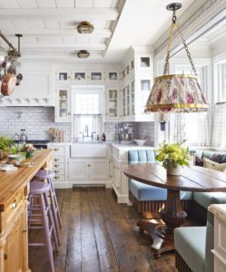
Say goodbye to your cold metal barstools and welcome cushier seating to ensure your kitchen is as comfortable a place to work, lounge, and enjoy a cocktail as it is in which to cook.
“I think kitchens are getting bigger in order to incorporate some soft seating and dining seating,” says Sallick. “Everyone wants to be there, and while the kitchen was once for dining and eating, it is now the telephone room and media center and study hall—and you still have to cook and clean. There needs to be more seating to accommodate that.”
Blank notes that when it comes to the design of new homes, she is seeing the kitchen become the actual center of the house, and it is no longer seen as a “back-of-the-house” space, finally catching up to the modern times, where most of us don’t have a slew of help. The kitchen has earned its right to be front-and-center, but it likely need a little help getting there.
“As the kitchen is becoming the new living room and family room, there needs to be a little of everything,” Blank says. “We’re seeing nicer dining areas rather than a simple kitchen table, or a breakfast room opening up into the space. You have your nicer seating, your art, different moods and colors and materials, and then the functionality after that. It’s a really exciting time for kitchens.”
(Veranda Dec 23, 2020)
