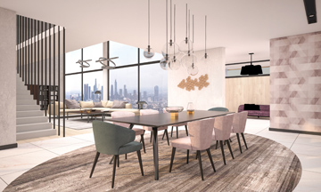
First Light is Benjamin Moore’s 2020 Colour of the Year.
As we settle into a new decade, projected design trends for 2020 are being put to the test. What will stick and what won’t in the coming year?
While it’s impossible to predict the future, architecture and design thought leaders do have some insights into the broader implications of four pivotal colour forecasts for 2020, which include three blue hues as well as a cool pink.
If these colour forecasts are any indication of the year ahead, 2020 is sure to be a bold one. Each projection spotlights a rich and uplighting hue, marking a shift away from stark whites and grays. For instance, Pantone named Classic Blue its 2020 Colour of the Year, while Sherwin-Williams chose Naval, and PPG selected Chinese Porcelain. Benjamin Moore—the outlier in the group—opted for First Light, an upbeat pink.
“It’s fascinating to see the alignment of these three major companies trending towards various hues of blue, while Benjamin Moore holds onto pink,” Jennifer Bonner, co-director of the Harvard Graduate School of Design Master in Architecture II Program and an associate professor of Architecture. “Pink is this colour that doesn’t seem like it is going away anytime soon after gaining traction in the mid-2010s. Referred to as millennial pink, now we see a large variety of blush pink or almost nude pink completely saturating café interiors, sweaters, ceramic tiles, furniture, and home goods. It’s flooding our Instagram feeds. The true test would be if the Paul Smith store on Melrose Avenue in L.A. would repaint their bubblegum pink facade to 2020’s blue or this cool pink, ditching the bubblegum tone. Would spectators still show up to snap insta-stories and snapchats?”

So why did three major brands opt for vibrant blue hues this year? One clue may lie in product language. Bonner points out similarities in the descriptions used by Pantone, Sherwin-Williams, and PPG for their respective hues, which incorporate words such as “calm,” “serenity,” and “restful.” “There seems to be a positive hopefulness for the upcoming decade,” she adds. “All fingers are crossed that their combined effort works on calming daily rituals and thrusting our lifestyles into a new decade.”

“The Colour of the Year projections always are a reflection of the time,” says Pamela Klein, Parsons Emeritus Faculty of Colour. “I would speculate that a deep blue, which feels very cozy, since it surrounds you, is comforting in a moment when people are feeling stressed.” Blue also is a colour with far-reaching cultural implications, Klein notes. For example, throughout Greece many homes feature bright blue doors, painted such for good luck. As for Benjamin Moore’s First Light, Klein likened the colour to eating ice cream: “a sweet way to take our mind off things.”
Colour of the Year projections tend to cause a ripple effect, influencing manufacturing choices and consumer decisions by reminding us of our emotional connection to colour. “We have a sensual response to our environment, and colour; it leaves us with a feeling that we remember,” adds Klein. “But a lot of people are afraid of colour, for some reason—it’s a bit ephemeral and mystical, so Colour of the Year projections help encourage exploration.” This year’s deep blues and soft pink seem positioned to do just that.

But will 2020 colour projections stay relevant as the decade progresses? Paula Wallace, founder and president of the Savannah College of Art and Design, predicts that what is arguably the most dependable colour in the group will have the broadest impact. “Pantone’s Classic Blue is the most pleasing and versatile of the 2020 colours of the year. The colour of trust; it’s a hue lawyers are advised to wear,” says Wallace. “Reminiscent of a dusky evening sky in Provence that takes hours to turn into night, Classic Blue is likely to be popular for a decade at least.”


